
Underneath the arches
The Millennium Galleries in Sheffield provides an elegant route linking the university quarter to the city centre, as well as being a valuable cultural destination in its own right, writes Kieran Long.
Maybe it was the weather. A beautiful spring day and a train trip out of London, away from a crumbling public transport system and litter‑filled streets. It has to be said, though, that Sheffield would not be most people's first choice for a break from the metroboulot‑dodo megalopolitan grind.
However, the Steel City is one of those places that shows why a truly civic feeling is almost impossible in a city the size of London. Sheffield's council has reinvented the city centre as a place of public squares and well‑presented Victorian landmark buildings which have a sense of public ownership that few in London have. The scale is grand and they are relics of the city's rich industrial past.
However, on a beautiful sunny day, the visitor does not read them as signifying a city in decline. Rather, along with the city's modernist landmarks ‑ the 1966 extension to the cathedral of St Peter and St Paul, the Crucible Theatre and the seventies town hall extension they make up a city which feels alive and generous towards its inhabitants.
Like those examples, this is identifiably a civic space, that will be used as a route to the city-centre. The galleries are housed in concrete barrel vaults, but along the spine the concrete gives way to glass blocks, making for a very light space. In fact, the lux levels here are around half those outside, making this space a good preparation for the darker galleries. This is a very successful space, and a very exciting civic facility. The precast concrete structure is legible and satisfyingly solid, and the materials and proportions are subtle and plain enough to appear durable and classy. It is a pleasure to walk through.
The galleries themselves are also successful. The vaults have an idiosyncratic character, but feel grand enough to give the feeling of a major cultural institution. The 10 vaults, which measure 7.5m by 15m act as bays which can be divided or opened up as exhibitions demand.
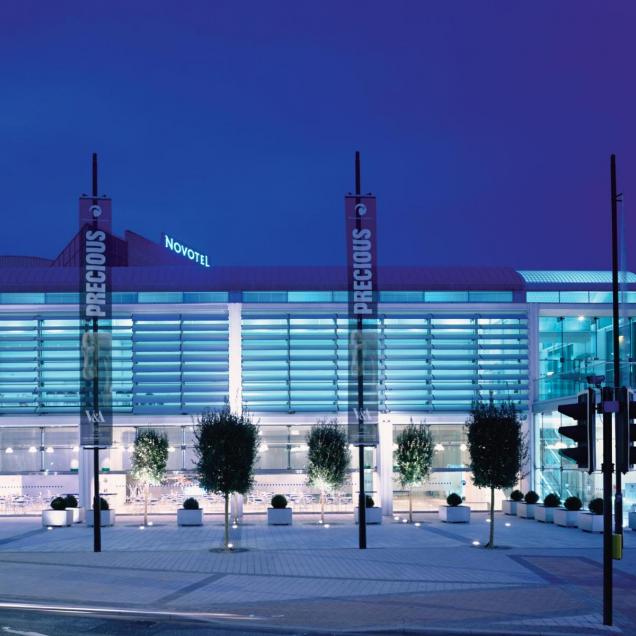
The opening exhibition, a selection of artefacts from the V&A called Precious, uses three bays, and is very successful in using them to provide a route round the exhibition, leaving just enough open space. The galleries can be configured in any combination of bays, giving great flexibility. This works very well, except when an exhibition inhabits just one bay. In this case, the galleries feel more like retail units in a mall than places for art. This risk is one that the architect has dealt with very well in the rest of the building, but, although the height of the ceiling and the finishes clearly demarcate it as something more than this, a single bay gallery with a glazed wall leading on to the processional spine of the building cannot avoid feeling a bit like part of a modern shopping centre.
It may be that this high-class-mall impression will be the thing that makes the gallery an accessible and democratic resource. However, it is vital that the main route through the building is kept clear of visual clutter, and the shop, which inhabits the north end of the route, is not allowed to compromise the view down the space. It is a fine line, but as long as the route is treated as a civic facility and not a retail opportunity, it can stay on the right side of it.
The environmental strategy of the building has been elegantly integrated into the structure. The architect has manipulated floor-slab heights to create a hypocaust floor, which, along with the cavities in the concrete columns, forms an efficient air circulation system that does not require overbearing duct-work. Gutters prevent direct light coming in to the galleries, and also conceal wiring and other services. Although Pringle says that his work at Michael Hopkins was an influence on the building, his treatment of servicing is very subtle and the building is more modest about its clever manipulation of light and air than much of Hopkins' oeuvre. Thermal mass is created with precast concrete roof panels and an exposed fair-faced concrete floor-slab providing a radiant surface to the back of house facilities below the main gallery level.
Comparisons are inevitable between this and Louis Kahn's Kimbell Art Museum in Texas and this Pringle Richards Sharratt building stands up well. The site in Sheffield is so tight that the east and west facades are not seen in their entirety, but the exterior is influenced by the Kimbell too, with the floorslab level expressed as a podium on the exterior. However, the vaults do more than just pay homage to this classic, making sense of a steeply sloping site, creating crypt-like back-of-house facilities underneath the main galleries. The choice of vaults creates flexible exhibition spaces, and will complement the soaring, glass Winter Garden which is due to go on site soon.
The most important aspect of this project is its contribution to the innercity renaissance of Sheffield and the permeability of the area between the city centre and the cultural/university quarter It creates a high-class pedestrian link between the city's two hubs, while providing an exciting cultural facility in its own right. In this way it feels like a very mature lottery project. This is the antithesis of many of the Millennium Commission-funded object buildings that have sprung up all over the country, and contributes something to the fabric of Sheffield that will soon seem like it has always been there. The architect has been disciplined enough to make the most of a tight site, and offer another very good reason to visit Sheffield in the near future.
The effort on the part of the council to draw life back into the city centre has been cannily applied. It realised that creating large-scale retail development would not alone he enough to create a city centre and compete with the massive Meadowhall out-of-town shopping centre 'Thus it decided to create a "cultural industries quarter", close to the central station and Sheffield Hallam University.
The best-known component of this was a high-profile failure - Branson Coates' National Centre for Popular Music, which now lies empty and forlorn, and awaiting conversion into a nightclub. Round the corner from this is the first completed element of the most ambitious cultural project in Sheffield the Millennium Galleries and Winter Gardens. This will be the element that connects the cultural quarter to the city centre, with the galleries conceived as reaching out towards the station to draw people in and through to the city centre.
The as yet unbuilt Winter Gardens will be a glass vaulted greenhouse, which, along with the recently completed Peace Gardens will be a city centre Eden for the citizens of Sheffield. The Millennium Galleries themselves, which opened last week, will provide 1,900 sqm m of display space, most of which will welcome touring exhibitions from the likes of the Victoria & Albert Museum, The Tate and the National Portrait Gallery, with three permanent galleries showing an exhibition on the city's metalworking heritage, a collection of artefacts and drawings from the John Ruskin collection and a crafts-oriented exhibition.
The main entrance is from a floor below the level of the galleries themselves. A glass façade with controllable louvres dominates the view from the street, with a café which will open on to the street in the summer. Escalators lead up to the main galleried spine of the building, from which the display spaces are accessed. This spine owes a debt, says architect John Pringle, to the generous Galleria arcade in Milan, and the covered shopping arcades in northern cities of England.
© Building Design 2001